RaiseNow
Campaign creator
Campaign creation, streamlined
- Role
- Product Designer
- Year
- 2026
The problem
RaiseNow's donation form editor had grown without a redesign: settings stacked in vertical accordions, a header that ate the editing space, and six languages edited field by field. Non-technical users, the people it exists for, found it overwhelming.
What I did
I ran a workshop with product and engineering to diagnose the editor. Five themes came out (layout and space, information architecture, multi-language, cognitive load, conversion), and the prioritised roadmap became the brief.
The editor
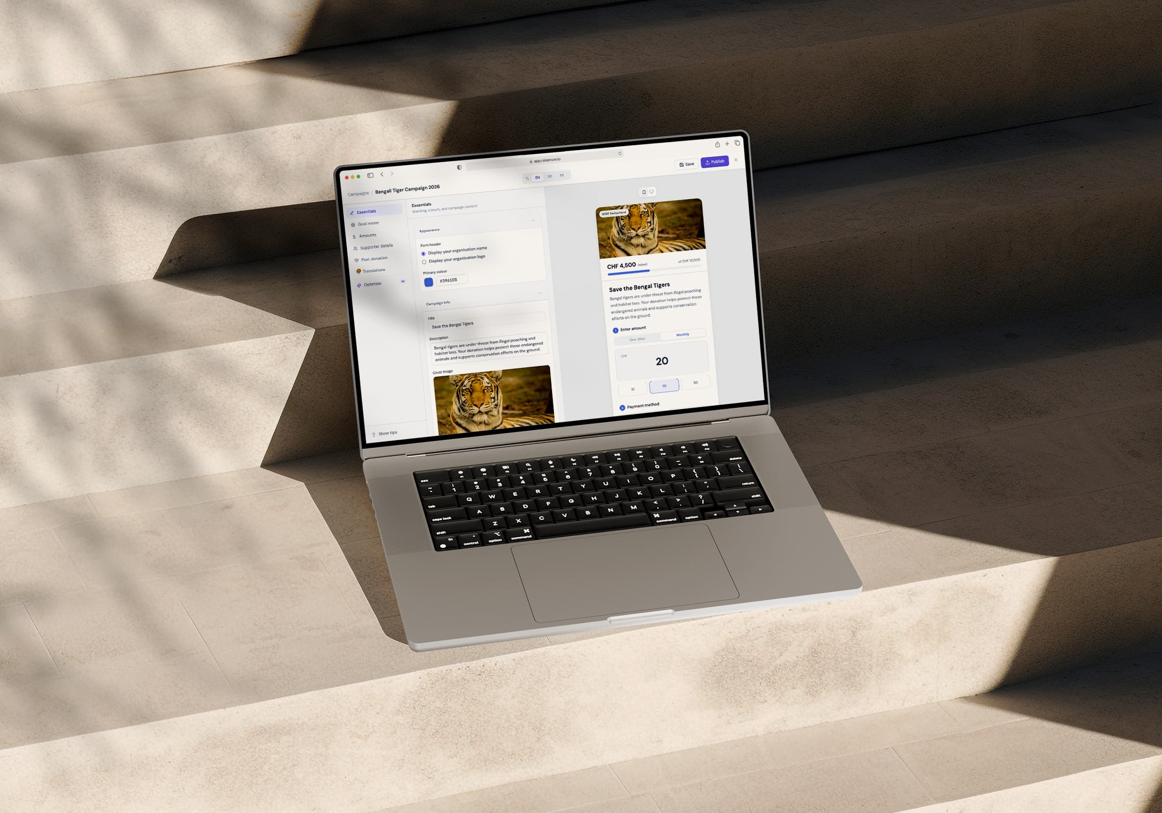
The editor is now a full-screen shell: a persistent sidebar of six sections named in fundraising terms, the form, and a live preview beside it. A short wizard before it sets the campaign type and name, so you start with context.
Translations
Translations live inside the editor, one tab per language with a count of the fields still to fill. AI drafts the empty ones in one action.
Optimise
Optimise is a long-term roadmap item, prototyped as suggestions you review one at a time. Each card shows the change as a before and after with the reason for it, and you apply or skip it.
Outcome
A working prototype in code, from lo-fi sketches to the full creation flow: type selection, configuration, multi-language copy and AI-assisted optimisation.